Charts
When dealing with a large amount of data, visualizations can help to better understand what is going on.
Roboquant comes with several types of charts included that can help to understand how an algo-trading strategy is behaving.
This page shows a few of those charts. All the charts are based on the excellent EChart library and are fully interactive. You can zoom in areas of interest or filter only those values you want to see. This is especially useful for analyzing large back tests that generate a lot of metrics.
| You can try these charts yourself right now in your browser without any installation required, since they all come from the charts Jupyter Notebook. |
Pricing
You can see prices and optional trades that were executed in relation to the price of that asset. Especially for strategies based only on price actions, this helps to validate if trades occurred when expected.
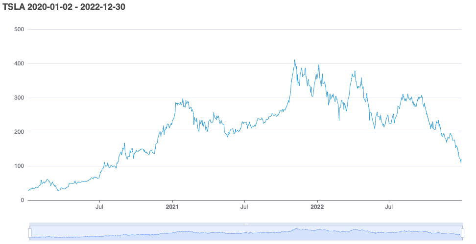
PriceChart
This chart supports plotting any type of price action, ranging from quotes to order books.
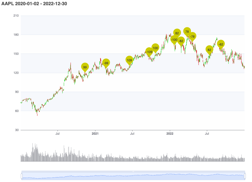
PriceBarChart
PriceBar charts display the price action for a given time period as a series of individual price-bars or "candles". Each candle represents the open, high, low, and close price for a specific time interval, such as one day or one hour. The body of the candle represents the difference between the open and close price, while the "wicks" or "shadows" at the top and bottom of the candle represent the high and low prices for that interval.
The color of the candle can vary depending on whether the price closed higher or lower than it opened. Typically, a green or white candle indicates that the price closed higher than it opened, while a red or black candle indicates that the price closed lower than it opened.
The example below also shows the trades that occurred and the sizes of those trades in the same chart as the actual candles.
Time Series
You can easily plot time-series, like the captured metrics during a run, using the TimeSeriesChart. Not only can it plot a metric that was captured during a single run, it also knows how to plot a metric over multiple runs.
Single Run
Walk Forward
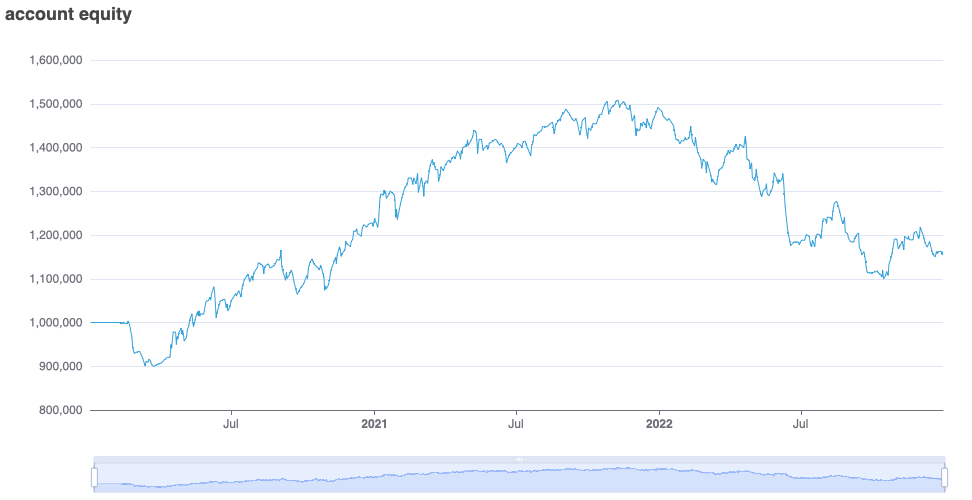
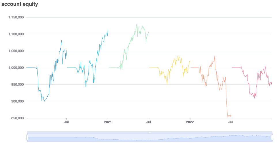
Plot a metric during a walk-forward test to provide insight into the performance of the strategy during different timeframes. The walk-forward test involves dividing the historical data into multiple timeframes or "windows," and using each timeframe to test the performance of the strategy.
Here we plot the account equity, the sum of the cash and positions. That provides insights on how a strategy performs during different timeframes. Clearly, we can see that the strategy wasn’t profitable during every timeframe.
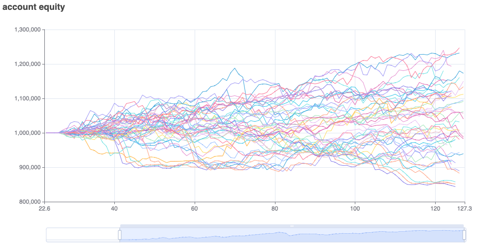
Monte Carlo
An even more extensive back-test is to run the experiment over randomly sampled timeframes of a fixed duration. In this example, we selected the duration to be 250 trading days. We then plot the results of all the samples, and this provides a good view of the distribution of the profit/loss a strategy could generate over 250-days timeframe.
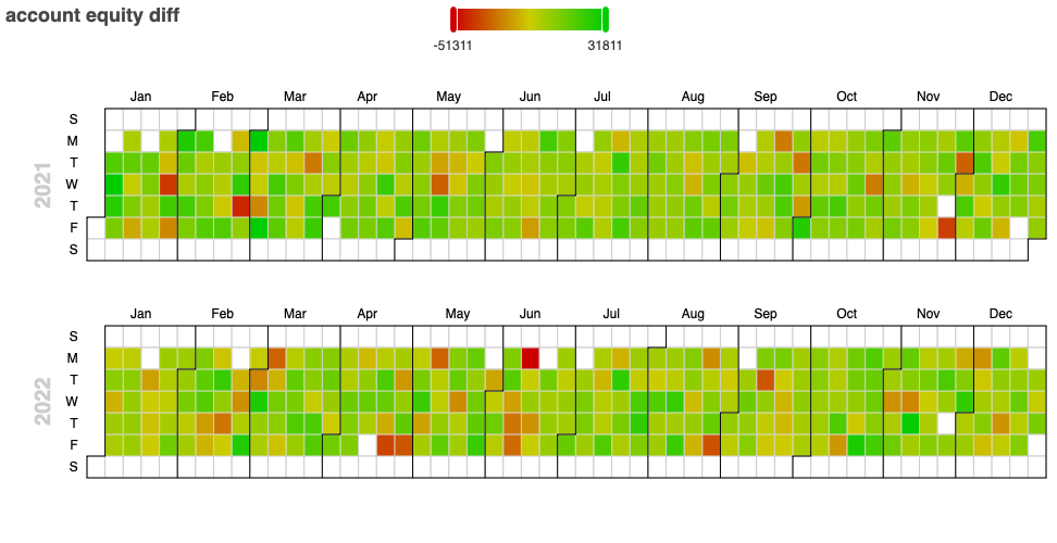
Calendar
Plot a metric for each day of the year to see how it performed over time. This presents a nice overview of good and bad performing days during the back test.
The slider at the top of the chart allows filtering the range of values that is of interest.
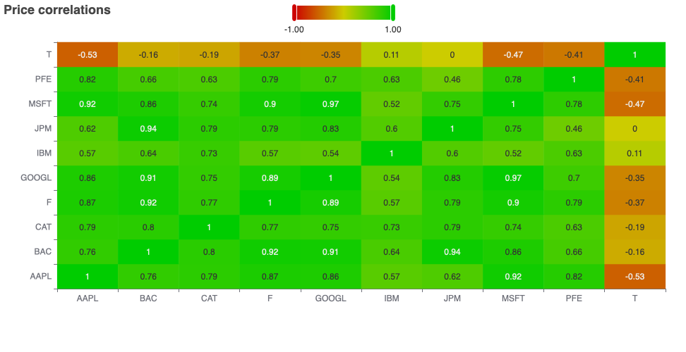
Correlation
Another interesting visualization is the correlation matrix. In general, a correlation matrix is a matrix that shows the correlation coefficients between several variables. Each variable is listed both in the rows and columns of the matrix, and the cells of the matrix show the correlation coefficient between the variable in the corresponding row and the variable in the corresponding column.
In roboquant the variables are the prices of different assets, and the matrix shows how they are correlated to each other during a certain timeframe.
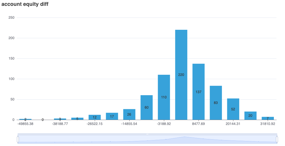
Histogram
When you quickly want to see how values are distributed, you can use the HistogramChart. Histograms are often used to visualize the shape of the distribution of data, including the location and spread of the data, as well as any skewness, kurtosis, or other features of the distribution.
They can be useful for exploring patterns in data, identifying outliers, and determining the appropriate statistical analysis to use for a particular data set. The following chart shows a histogram of daily equity returns over a period of time.
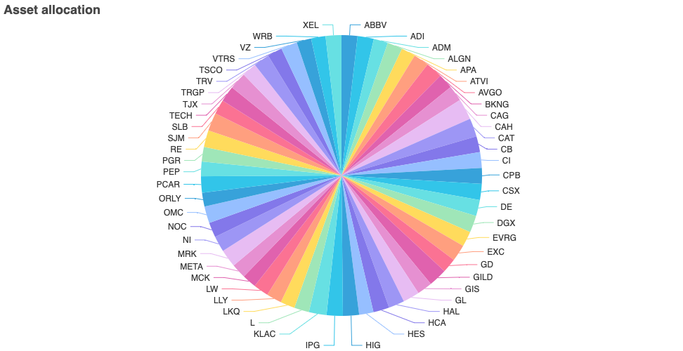
Allocation
With the AllocationChart you can the asset allocation for a set of provided positions. If the assets are denoted in different currencies, these will be converted to the base currency of the account.
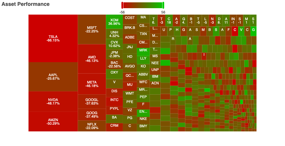
Performance
This chart shows the performance of the various assets fond in a feed. The color of the box indicates the performance and the size of the box the total trading volume.
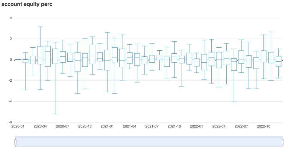
Box Plot
Box plot aggregates a metric over a time interval, so the different values for certain quantiles can be easily spotted. When we plot the change in account value as in the chart below, it provides quick insights into max draw-downs and volatility of our strategy.
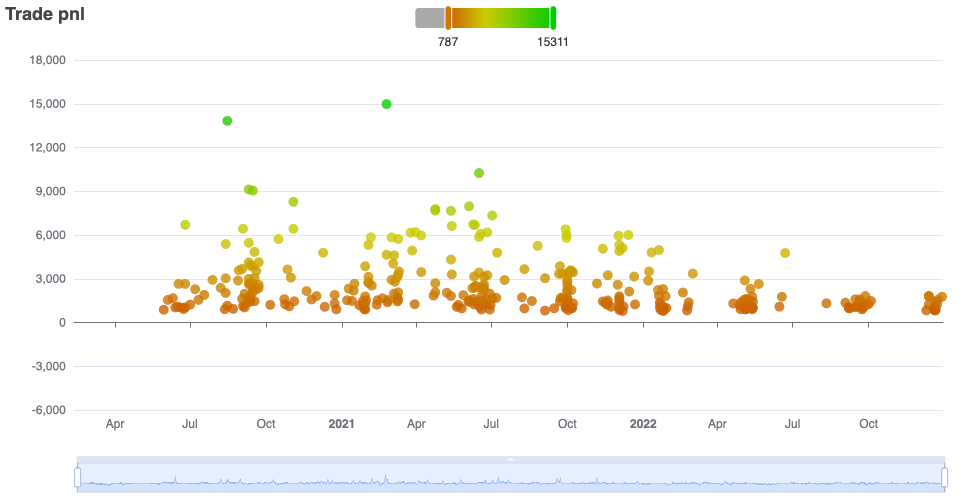
Trades
The TradesChart provides an overview of the trades for all the assets made during a certain time period.
It can plot different aspects of a trade like the fees or volume. But one of the most interesting aspects is the realized profit and loss.