%use roboquantJupyter Notebooks
Usage
Developing an automated trading strategy requires experimentation and testing. An interactive development environment like Jupyter Notebooks is ideal in such scenario. Especially in the starting phase, it can help to progress a lot quicker.
Roboquant is designed to be used in both standalone JVM applications and Jupyter Notebooks. The exposed APIs are convenient to call from a Jupyter Notebook without too much ceremony and there are many charts included that make it easier to interpret what is going on during a run.
Using roboquant in a Kotlin Jupyter Notebook requires just a single command:
This will automatically load some roboquant libraries. It will load the modules roboquant, roboquant-ta and roboquant-jupyter and import most commonly used packages from these modules.
Third party modules like Binance and Polygon are not included by default.
If you run Welcome() in a notebook cell afterwards, you’ll see the exact version of roboquant you are using together with information about the environment you are in. You can also run a quick demo to validate if everything is working as expected using a statements like Welcome().demo1()
You can also load a different version of roboquant and additional modules (separated by a :). You’ll need to specify and add the appropriate import statement.
%use roboquant(version=2.0.0, modules=binance:polygon)
import org.roboquant.binance.*
import org.roboquant.polygon.*| Chromium-based browsers perform best. Especially when you plot charts with many data points, the webpage stays more responsive. |
Importing other libraries
You are not limited to using roboquant libraries only. In fact, you can use any Java or Kotlin library that is published to some repository or is available on the local file system.
@file:DependsOn("org.xyz:abc:1.0.0")
@file:DependsOn("someLocalFile.jar")

import org.xyz.abc.*
Charts
Roboquant uses the excellent Apache ECharts JavaScript library to render charts in your browser. All charts are interactive, meaning you can zoom into areas of interest, and you can often filter by values of interest. There is a toolbar at the top right of each chart that allows for additional functionality, like downloading the chart or seeing the raw data.
// Metric related charts
BoxChart(data)
HistogramChart(data)
CalendarChart(data)

// Price related charts
PriceChart(feed, asset)
PriceBarChart(feed, asset)
CorrelationChart(feed, assets)

// Asset related charts
AllocationChart(account)
PerformanceChart(feed)

// Trade related charts
TradeChart(account.trades)
TradeChart(account.trades, perAsset = true)
Design Philosophy
In order to build robust and well performing trading algorithms, you often need to diversify across assets and asset classes. So a lot of the visualizations are focused on providing insights on what is happening in such scenario and less in plotting the metrics for a single asset only.
All the charts are tailored for roboquant usage and are not a generic plotting library. So typically with just one line of code, you plot a very feature rich chart. However, adding a new custom chart is not much work either, see also Custom Charts.
Global settings
If you have to plot a lot of samples (> 500,000), your browser can become unresponsive. To avoid this problem, you can limit the number of samples sent to the browser. The default is unlimited.
Chart.maxSamples = 100_000 // Max samples to use when drawing a chartGeneral usage
If the chart instance is the last statement of a notebook cell, it will get rendered automatically.
    // If the statement is on the last line, the chart will get plotted
    TimeSeriesChart(data)
However, if the chart instance is not the last statement in a cell, you’ll need to invoke the render() method. This is also the way to plot multiple charts.
// Plot the correlation matrix over different timeframes
for (timeframe in Timeframe.past(20.years).split(2.years))
    CorrelationChart(feed, assets, timeframe).render()
You can also customize charts. This allows you to change the eCharts options before it is being rendered.
val chart = TimeSeriesChart(data)
chart.customize = {
    backgroundColor = "yellow"
}
PriceBarCart
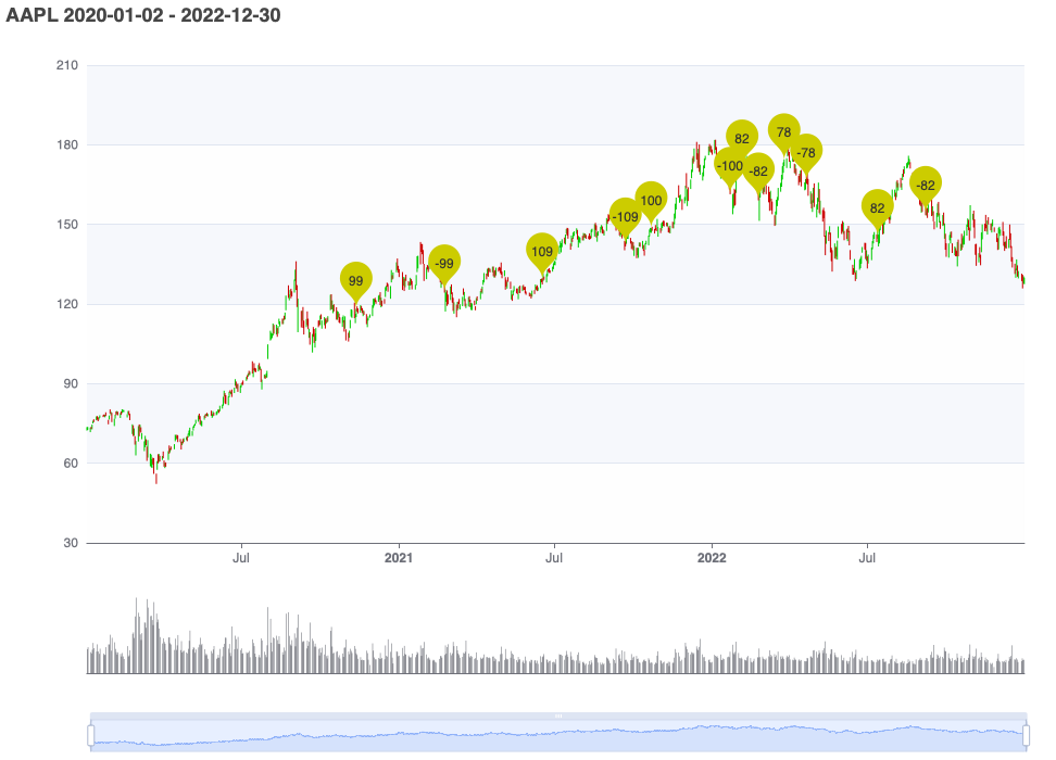
The main features of this chart include:
-
shows the PriceBar actions (also referred to a candlesticks) for a certain
Assetin aFeed -
provides an overview of the volume in the same chart (if the feed has this information)
-
can handle a large number of candles, and you can easily zoom into smaller timeframes to see more details
-
you can plot trades for the same asset in the same chart to see when they were created.
// Plot prices of a known stock
PriceBarChart(feed, Stock("AAPL"))

// Plot the prices of the first asset from a historic feed
PriceBarChart(feed, feed.assets.first())

// Plot how Apple performed during the 2008 financial crisis
val apple = feed.assets.getBySymbol("AAPL")
PriceChart(feed, apple, timeframe = Timeframe.financialCrisis2008)
PriceChart
Similar to the functionality offered by a PriceBarChart, but this chart displays a single price and not a candlestick. As a consequence, it can be used to plot any type of PriceAction and not only a PriceBar. So if you have a feed with order book data or trade prices, this is the chart to use.
CorrelationChart
Plots the Pearson correlation for a set of assets using the prices found in the provided Feed. You can optionally specify the timeframe to take into account.
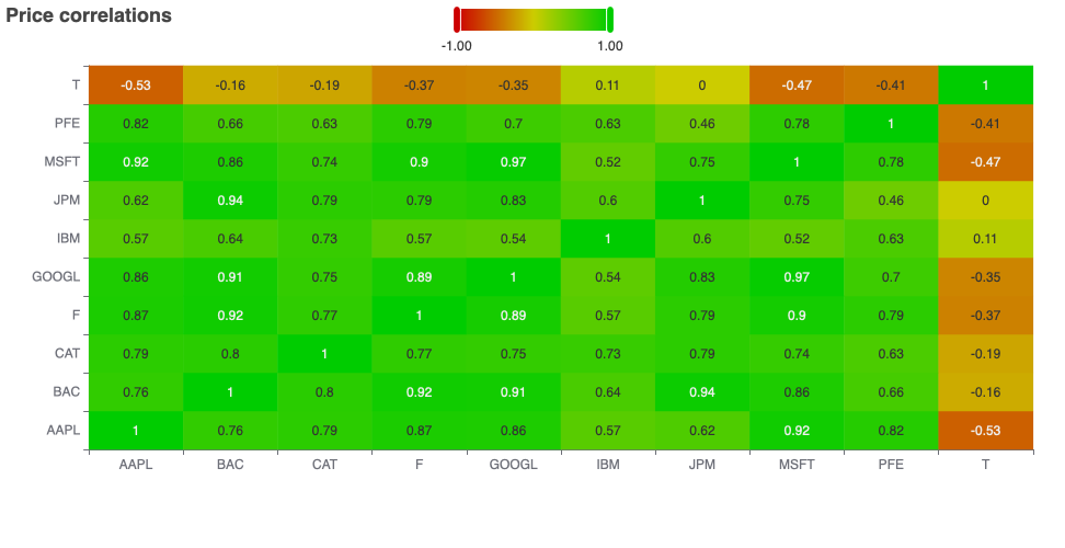
val assets = feed.assets.take(10)
CorrelationChart(feed, assets, timeframe = Timeframe.past(2.years))
TimeSeriesChart
Plots one or more time-series. If there are multiple time-series provided, each time-series will be plotted as its own colored line. A common use-case it to plot the metrics that have been captured during one or more runs.
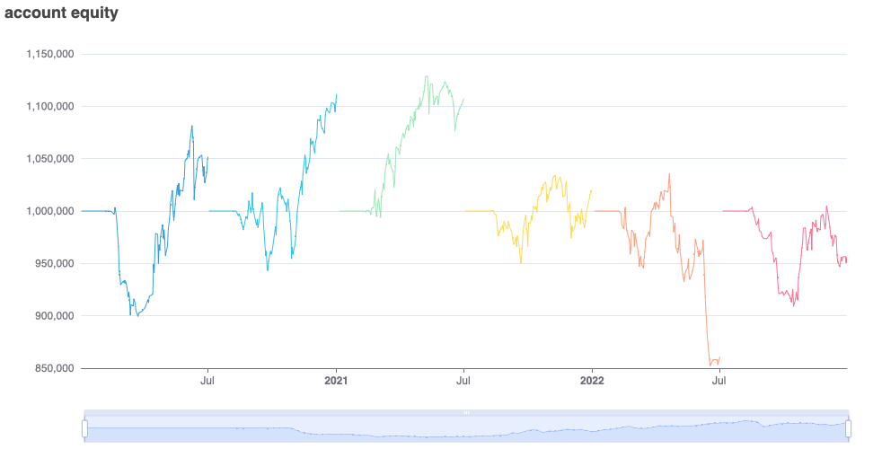
// Get the equity for multiple runs
val equities = journal.getMetric("account.equity")

// Plot all the equity curves
TimeSeriesChart(equities, useTime = false)
CalendarChart
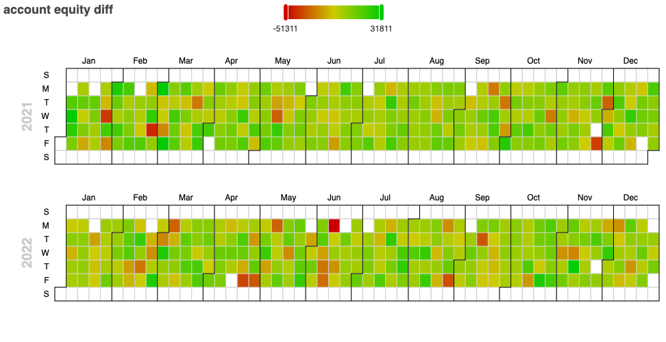
Plots a time-series on a daily calendar, using color-coding (heatmap) to indicate how each day performed. If you quickly want to see which days had the highest and lowest PNL, this is a great chart to use.
TradeChart
Plots all the executed trades from a run. You can provide the aspect of the trade you are interested in.
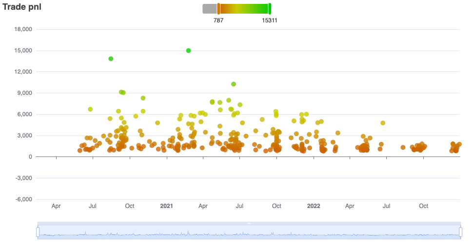
val trades = account.trades.takeLast(100)
TradeChart(trades)
OrderChart
Similar to TradeChart, but this one plots all the placed orders. In general, trades contain more info (like realized pnl) than orders, so the TradeChart might prove to be more useful.
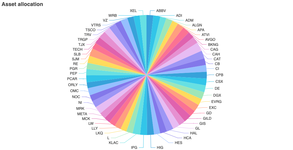
AllocationChart
Show the asset allocation of your positions, so how much you are exposed to the different assets.
Custom Charts
Developing your own chart is not difficult. Roboquant uses the excellent ECharts-Java library that makes it easy to create almost any chart from within your Kotlin code.
Have a look at the source code of one of the included charts for inspiration. If you think your chart would also be useful to other algo-traders, consider creating a PR to have it included.